

Consumers buy online because of the undisputed time and convenience-related benefits. Just like people are able to book their flight tickets and hotel rooms for a holiday in advance, they expect to be able to book their next rental gear conveniently online.
A well-built and designed ecommerce website affects the overall online shopping experience and even determines whether you get the conversions you’re after or not. So, without further ado, let’s dive into the factors of a good ecommerce website.
1. Trust
What is website trust?
Website trust means whether your website visitors, upon arriving at your website, find it to be trustworthy. Finding your brand and your website trustworthy means that your visitors are more likely to do business with you. If you’re a small business that’s just getting started in the world of ecommerce, it’s likely that your website visitors aren’t that familiar with your brand. Just like with a brick-and-mortar store, your website needs to be welcoming, friendly, and feel familiar even if they don’t know your brand yet.
While there are many things that affect a purchase decision, one of the biggest influencers on a purchase decision is trust. According to an Edelman Brand Trust Survey (2019), 81% of survey participants say trust impacts their purchasing decisions. Trust directly impacts your conversion rate. A research study by PushOn suggests that the lack of consumer confidence may delay the final purchase decision or in the worst-case scenario, push your potential customers to shop somewhere else.
Why is it important?
The first thing your customers see leaves the impression of the kind and the quality of products and services they will be receiving. Even before cheap prices, the biggest factor that makes or breaks a customer’s buying decision is whether or not they find the business trustworthy. Customers want and need to know who they’re getting involved with, so having all necessary information available to them is vital.
How to improve your website's trustworthiness?
Visible contact information
The fastest way to lose a customer’s trust and patience is not to have your contact details easily available. Have your email, phone number, different locations (and their details) visible on the bottom of each page, as well as its own dedicated landing page. Make it easy for your customers to contact you if they have any questions or feedback: include a contact form on your website that your customers use.
Rent & return policies
Having clear policies and step-by-step walkthroughs of the renting and return process actually helps decrease shopping cart abandonment rates. By making policies available and easy to understand, you’re increasing the customer’s confidence in what to expect and also meeting those expectations.
Social Proof
It’s always a good idea to include possible reviews or your social media posts on your website. Different platforms allow more ways to showcase your brand and create that bond of trust with your customers, without overcrowding your website. Reviews, on the other hand, offer first-hand experiences from your previous customers, which again increases the level of trust between your potential customers and your brand.
2. Visual appeal & Simple layout design
What is website design?
As the name suggests, website design is all about the way a site is constructed and displayed online: everything from the visual appearance to user experience and content. The way the website looks, the quality of the photos used, and the overall layout directly affect the business’ image and, most importantly credibility.
According to Web Credibility Research from Stanford, 75% of a company’s credibility is judged based on its website design. Think about it, a poorly designed website may lead to potential customers not trusting your business.
Why is website design important?
First impressions are 94% design-related. If you and your competitor offer exactly the same, it’s guaranteed that the customer will choose the website that is more legitimate-looking in which visual appeal has a significant impact.
Just imagine a fruits and vegetable department in a grocery store. Ask yourself, as a consumer, do you prefer doing your groceries in a store that has the fruits and veggies in cardboard boxes, or do you instead go to a supermarket where the presentation is well-thought and finished?
Website design influences our behavior in the same way as in-store presentation. So, if you want to turn visitors into shoppers and increase your conversion rates, ensure your website follows the best practices.
How can you improve your website's design?
Simple layout
As the saying goes: less is more. A simple layout means all of the different elements of your website, such as text, menu, and graphics, are all in balance and aren’t overwhelming to browse through. Websites are like real estate - you don’t want to waste any space on unnecessary decorations or graphics that don’t serve a purpose. A simple layout is long-lasting and will help your website visitor to find the information they need in a single glance.
Colors
Selecting a specific color scheme helps support the consistency of your website. Too many different colors will be overwhelming for the customer, as it clutters up your website and makes it hard to find anything. The easiest way to create a color scheme is to incorporate your brand color, muted and neutral background colors for general texts, and a highlight color that would be used for special deals or notifications, for example.
Whitespace
Whitespace is the areas on your website that are intentionally left empty. They can be found, for example, in-between images and text blocks and in the margins of the page. Having whitespace does not only make your website look and feel less cluttered and more professional, it also helps to bring out all of the essential elements on your website and help your visitors to focus on what’s important. And no, it does not mean it has to be the color white.
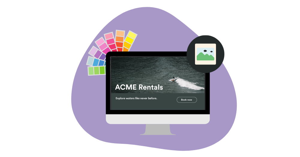
High-quality images
A picture is worth a thousand words. Because of the way people behave online nowadays, conveying your message faster and making your website more scannable is crucial: so tell your story and showcase your products and services through images rather than text.
Using larger images helps highlight your products and services more effectively and efficiently. Whether you use stock images or the ones you took, make sure they’re all high resolution and fit your website’s overall feel - try to incorporate the same colors and feel as your website and brand.
Learn more about the different types of product images →
Clear call-to-actions
The ultimate goal for each of your website visitors is to have them convert. When visiting different ecommerce websites, our brains are wired to look for clear messages of what the business wants us to do: shop now, rent now, learn more, contact us (this is where the highlight color comes in handy). What’s most important to remember is that there really is no need to reinvent the wheel - keep all the elements and copies familiar to other similar ecommerce websites to make the browsing and shopping experience easier.
3. Smooth browsing
What is smooth browsing?
Browsing means users' interaction with your website. At the center of every smooth online customer experience is a well-thought user experience (UX). UX is what makes sure that your website is not only functional but also easy to navigate and user-friendly. By combining high usability and functionality, you’re providing your customers with a pleasant shopping experience on your website.
Fortunately, the majority of website-building platforms have ready-made templates that are specially designed to make building your ecommerce website easier and smooth from the customers’ perspective.
Why is smooth browsing important?
A website that is hard to use causes confusion and ultimately develops frustration about the shopping experience, which can lead to users abandoning the purchase and leaving the website.
Feel-good online experiences lead to customers building trust with your brand and coming back for more. This, on the other hand, leads to higher conversions, repeat purchases, higher customer engagement on different platforms, and ultimately customer loyalty.
Let’s put it this way: you have approximately 10 seconds to make an impression on your potential customers. Therefore, don't overwhelm your website users with complicated design, unclear navigation, or too much text: good website navigation should help your customers find your products and services, not the opposite. In addition to the user experience, good navigation can also help improve your website’s SEO, which helps in getting found in search results.
How can you make your website smooth to browse?
The first step to making sure your website’s navigation is smooth and simple is to have a clear website structure that categorizes the content on your website. Obviously, the optimal site structure is dependent on the products and services your business offers, but here are some examples.
Single purchase page
This is the actual page where your customers are able to buy your products and services. Have this as one of the most highlighted sections, as this is the one that brings you sales. Note that simple layouts with a single purchase page are optimal when you only have a limited number of products that are for sale or rent. In case your offering is larger, you’ll most likely need to have more subcategories and pages to have a way to filter through the different products.
Product categories
The kind of site structure that’s right for your website depends on the field your business operates. One common category split, when it makes sense, is to have products separated by gender and age: men, women, kids, and so on.
Another way is to divide your product categories based on seasonality: winter equipment, summer sports, accompanied by accessories, and different services your business offers, such as repairs, courses, and tours, for example.
Businesses selling multiple different products within one larger product category likely benefit from having more specific subcategories. For example, a company selling or renting cameras can have categories like video cameras, action cameras, 360 cameras, DSLR cameras, and so on instead of having everything listed under one general category.
Deciding on what kind of categories to include on your website depends on your business and your offering. The larger your offering is, the more categories and subcategories you should have in order to make finding the needed product or service easier.
Bestsellers
Highlighting your best-selling products and services makes it easier for your customers to find and choose the kind of products that have sparked the interest of other shoppers. This will also work as a shortcut to the checkout process and shorten the overall shopping experience for the customers.
Bestsellers are especially great to highlight when your website’s traffic is at its peak: so just before and during peak season. Combine this with campaigns, and you’ll, sure enough, have your website visitors making fast purchase decisions.
Campaigns
Special offers and campaigns are a great way to attract customers to your website. They trigger customers to make faster purchase decisions, which is why it’s important to also include and highlight these special offers and campaigns on your website on the navigation level.
Locations
If you have multiple locations that offer different products and services, you want to highlight them. Roll Outdoors is a great example of this: because they have different locations that provide their customers with different experiences, they also make sure to emphasize the different offerings they have.
About Us & Contact us
Just like we mentioned, these are extremely important sections to have on your website. Having information about your business immediately available decreases any unnecessary time that the customer has to spend in order to find it. If you have a great story that supports and enhances your brand image, have it as a part of the navigation. Otherwise, all needed information can be included in the footer that’s available on every page.
In short, keep your website simple and straightforward. If your most important objective is to get customers to buy and make bookings, make sure that the desired CTAs are as visible as possible.
4. Fast checkout
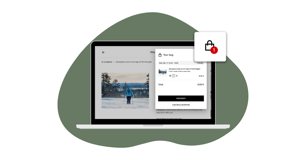
What is checkout?
In e-commerce, checkout refers to the point where the online customer decides to pay for the products she has added to her shopping cart. At the checkout phase, the customer is asked to fill in her information, contact details, and usually also delivery address. A smooth checkout experience is essential for a good online customer experience. By having an unclear, awkward checkout experience, you’re killing a sale and the trust of your potential customer.
Why is fast checkout important?
Nowadays, nothing turns a customer away more effectively than slow checkout. What’s even worse, it might give off the impression that something shady is going on. The fewer steps there are to checkout, the less time your customers have to get frustrated and change their minds. By focusing on the checkout experience, you have the opportunity to capitalize on upselling others and complementing products and services that can help improve the overall shopping experience.
How to improve your online store's checkout?
Again, many website platforms offer great, carefully designed ecommerce tools for your business, but here are some tips on how to make sure your checkout process isn’t what makes you lose your customer.
Staying simple and transparent is the backbone of anything that’s happening on your website: make sure the buyers can easily add products and overlook what they have in their shopping cart. Give customers different options when it comes to registration, payment methods, easy form-filling, and so on. This should all lead to a fast, easy checkout. A good design principle for longer checkouts is to spread out the steps into several pages. By doing so, you might add a few more clicks, but on the other hand, it makes the steps cognitively easier to comprehend.
It’s good to keep in mind that there is a difference between retail and rental e-commerce when it comes to the checkout process. In renting, the checkout includes more mandatory steps, such as choosing the rental & return period and filling in specific information required by the product type. While this might be annoying from the customer's side, including these steps already in the online checkout allows the rental business to prepare the gear in advance for the customer to pick up easily. Additionally, there can also be different deposits, waivers, and contracts to sign, which again prolong the process but are mandatory for the sake of the overall customer experience.
5. Page speed and response time
What is page speed?
Page speed represents the amount of time it takes for the browser to complete a request: loading a page and the content on it. There are many different factors that affect page speed and response time: type of content, images, CSS and code, website servers, user location, browser choice, and so on.
Why is page speed important?
A website that doesn’t react to commands or is just plain slow is never an enjoyable experience, right? Apart from a frustrating experience, this affects reaching potential customers - according to Business.com, the majority of consumers expect a web page to load in 2 seconds or less, while a whopping 79 percent of online shoppers stated they would not return to the website again.
Moreover, the speed of the website has been one of the most crucial factors affecting your search engine rankings for almost a decade now. The difference can be significant that only a few seconds shorter page load time can do to your search engine ranking and therefore, your organic website traffic.
How to improve your website's page speed?
Testing your website speed
Make sure your website is fast enough and commands are clearly reacted to because a slow website does harm to your website traffic, conversions, and, therefore, online sales. You can learn more about your website’s performance through Google’s Page Speed Test, which shows you your load time, the total number of requests, page sizes, page element distribution, and page load progression.
Optimize your images
Having images on your website that are unnecessarily large will slow down your website’s loading speed, especially when browning on mobile. Images that aren’t optimized and scaled right for the website and the different devices will cause your customers to have a frustrating and confusing experience.
WordPress, for example, offers plugins for image optimization like WP Smush. You can also use free online image optimizers like TinyPNG or ImageCompressor. In case you have an extremely image-heavy website, we would recommend considering using lazy-loading, which enables loading non-critical elements (like images) during the moment of need. Simply put, it loads the images as you scroll and reach the image in question. This reduces initial page load time, initial page weight, and system resource usage, all of which have positive impacts on performance.
Minimize HTTP requests
An HTTP request is made for each different element that is being downloaded by a page. So the more on-page components you have, like images, stylesheets, and scripts, the more time it takes for the page to render. Google Chrome has a great tool called Developer’s Tool, which lets you inspect how many HTTP requests your site makes. Getting rid of any unnecessary files will minimize the number of requests, which consequently will speed up your site.
Choose the right hosting option
When starting out with your eCommerce site, the first thing that comes to mind isn’t necessarily investing in a scalable hosting solution. While there are a few different options available, choosing the right one means being realistic about the amount of traffic you’re expecting to get on your website. There are shared hosting, VPS hosting, and a dedicated server.
Shared hosting means you’ll be sharing things like CPU, disk space, and RAM with other sites being hosted by the same server, meaning if one of the hosted websites gets a spike in traffic, everyone’s getting slowed down.
A dedicated server is all yours. While you get to enjoy the perks of private hosting and disk space, it also means more work to do with configurations and technical setup. VPS hosting, on the other hand, falls right in between.
6. Mobile Experience
What is mobile experience?
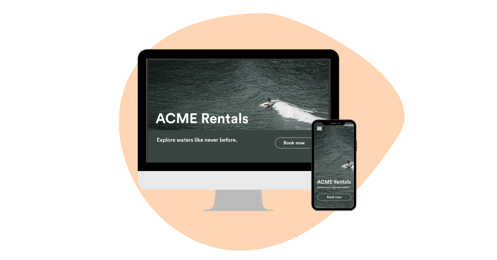
The mobile experience represents what your customers see when they visit your website through their mobile devices. What defines a mobile experience is how well what you see on your desktop scales down to a hand-held device. Because of the devices’ size difference, taking the different resolutions, image sizes, navigation, and so on is crucial. A responsive website that scales from desktop to mobile is nowadays a requirement for a successful ecommerce business. In Q4 of 2021, over 54% of total web traffic globally was generated from mobile devices.
Why is mobile experience important?
Mobile responsiveness does not only improve the on-site experience but, again, enhances your visibility in search engines. In 2018, Google announced that they are gradually moving websites to mobile-first indexing, meaning that the company gives more visibility to websites that provide a good browsing experience with a mobile device.
With an increasing amount of traffic generated from people browsing the internet and using applications with their smartphones, it’s crucial to make sure that the website, as well as the online shopping experience, are adapted for mobile usage.
How to improve your website's mobile experience?
As we’ve mentioned before, if you’re using a website builder like WordPress or Wix, your website will most likely automatically have a responsive design that scales to different devices and screen sizes. Making sure your customers have a pleasant mobile experience includes, for the most part, everything that a good website needs. But of course, there are a few differences. Let’s take a look.
Include large text & buttons
It’s obvious, but it shouldn’t be overlooked: make everything on your website big enough so your customers don’t have to zoom in to read it. It should fit the screen perfectly while still leaving enough white space for the website to feel spacious and not cramped.
Even more important: make sure your call-to-action buttons are big enough to be clicked on without having to zoom in or, even worse, without accidentally clicking on something else.
Create simple forms
The fewer steps your customer has in order to either order from your website or get in touch with you, the better, so make sure the forms used on your mobile website are a few steps shorter than the ones on your desktop website. Again, include large text and call-to-action buttons to make submitting their information effortless and easy for everyone.
Stay available
84% of consumers consider customer service to be a key factor when deciding whether to make a purchase. In case your customers have any questions, either make sure that your contact information is immediately available. A chat through which your customers can get in touch with your team is an excellent and mobile-friendly method of communication.
Final words
We know there’s a lot to chew on when it comes to building websites. Far are the days when you were able to build and leave your website to live its own life and still be founded. The Internet today is such a competitive environment that the most popular websites get updates multiple times a day.
Fortunately, there are countless website builders that include these tools already, as well as step-by-step guides to the different steps we mentioned before. So with a little time and patience, and by covering the basic things, even businesses with limited resources can compete online.